

CHARACTERIZE
SENIOR CAPSTONE
Characterization is a semester-long senior capstone project exploring narrative-driven character design through tactile, 3D media.
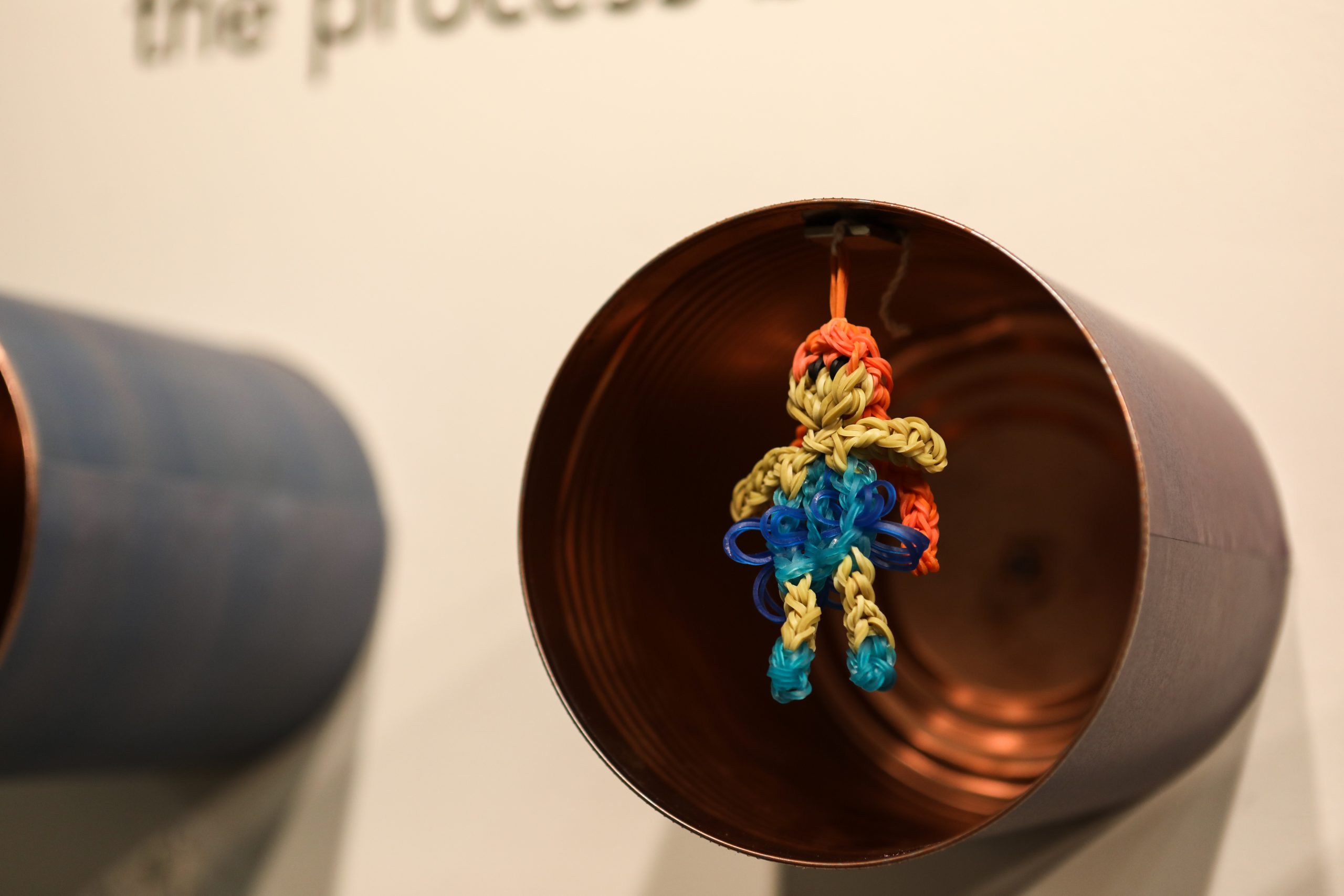
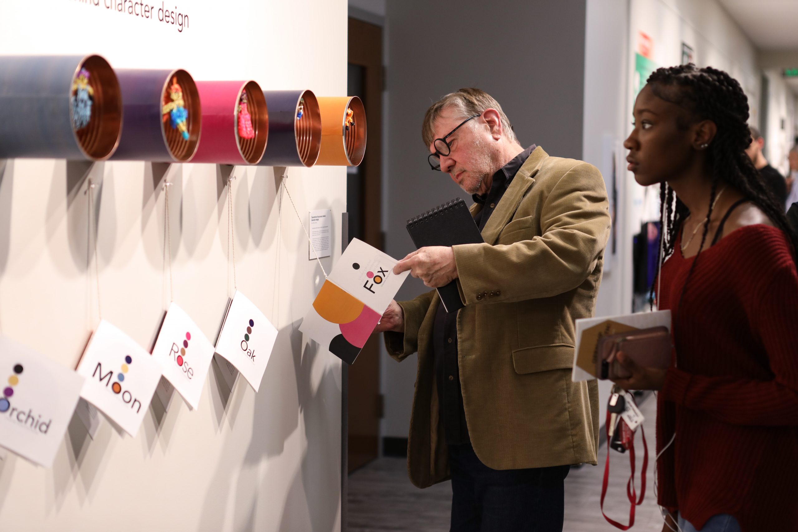
Installed in a gallery setting, the project showcased original characters built from unexpected materials, such as rubber bands and recycled coffee cans. Each figure was paired with a custom-designed book that detailed its personality and visual development process.
The project merges storytelling, design thinking, and hands-on experimentation to examine how physical form and color convey identity.
Personal research informed every design choice, from materials to layout, reflecting my interest in accessible, character-first storytelling.
Presented publicly, Characterization invited viewers to engage with the design process as both art and narrative.
THE PROCESS & INSTALLATION
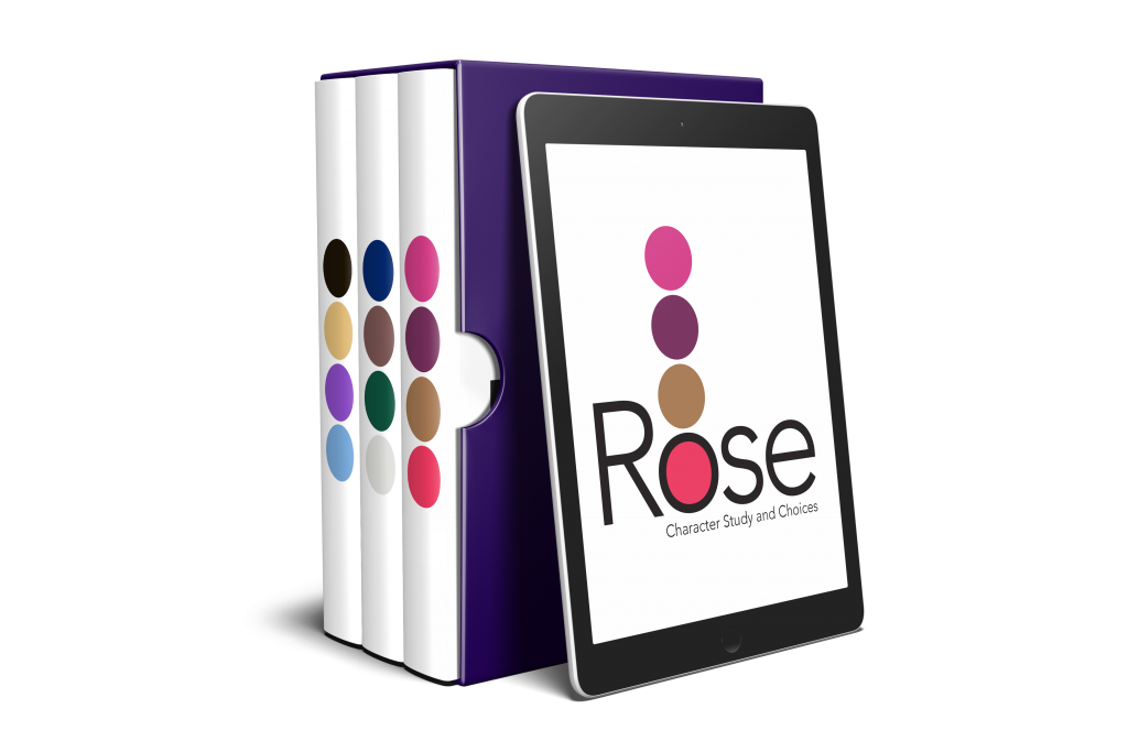
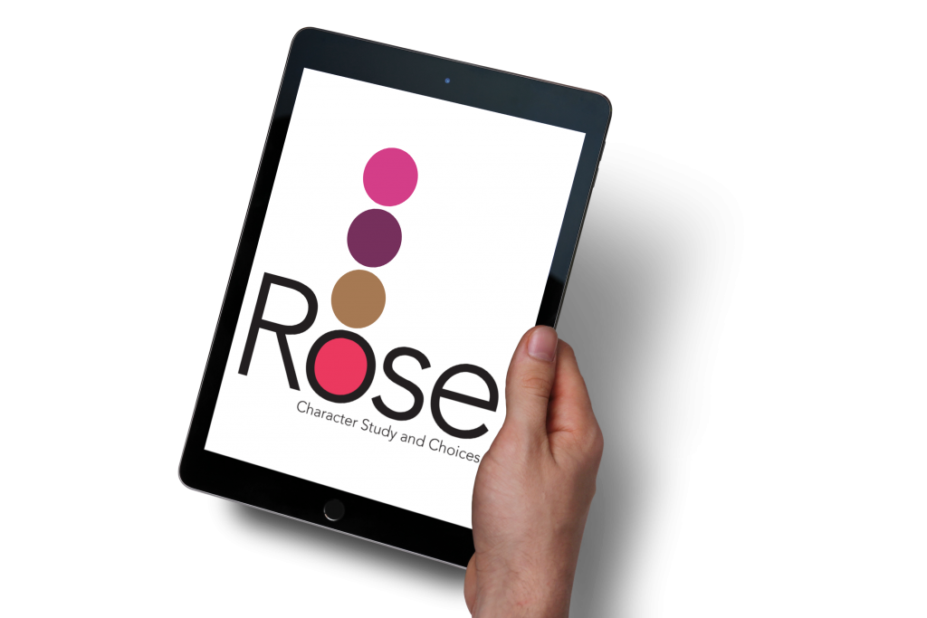
The final gallery installation of Characterization was the result of an iterative, research-driven design process focused on storytelling through form, color, and interaction. The project began with an exploration of character development principles. Each character was created from rubber bands and recycled coffee cans, selected for their everyday familiarity and visual texture. These materials became a metaphor for constraint and potential; reflecting the emotional journey of each character. Parallel to the physical figures, I designed a corresponding book for each character that documented their creation process, with an emphasis on color selection. These books were also rendered into mock-ups of UX designs.
Throughout the progress of the project, I conducted user feedback sessions and design critiques to refine both the character forms and the accompanying print materials. Characters were tested through a variety materials, such as egg cartons, 3-D printed toys, and ripped paper portraits. Layouts were tested for clarity, pacing, and visual appeal. Color palettes were developed not just for aesthetic value, but for their symbolic resonance with each character’s emotional arc.
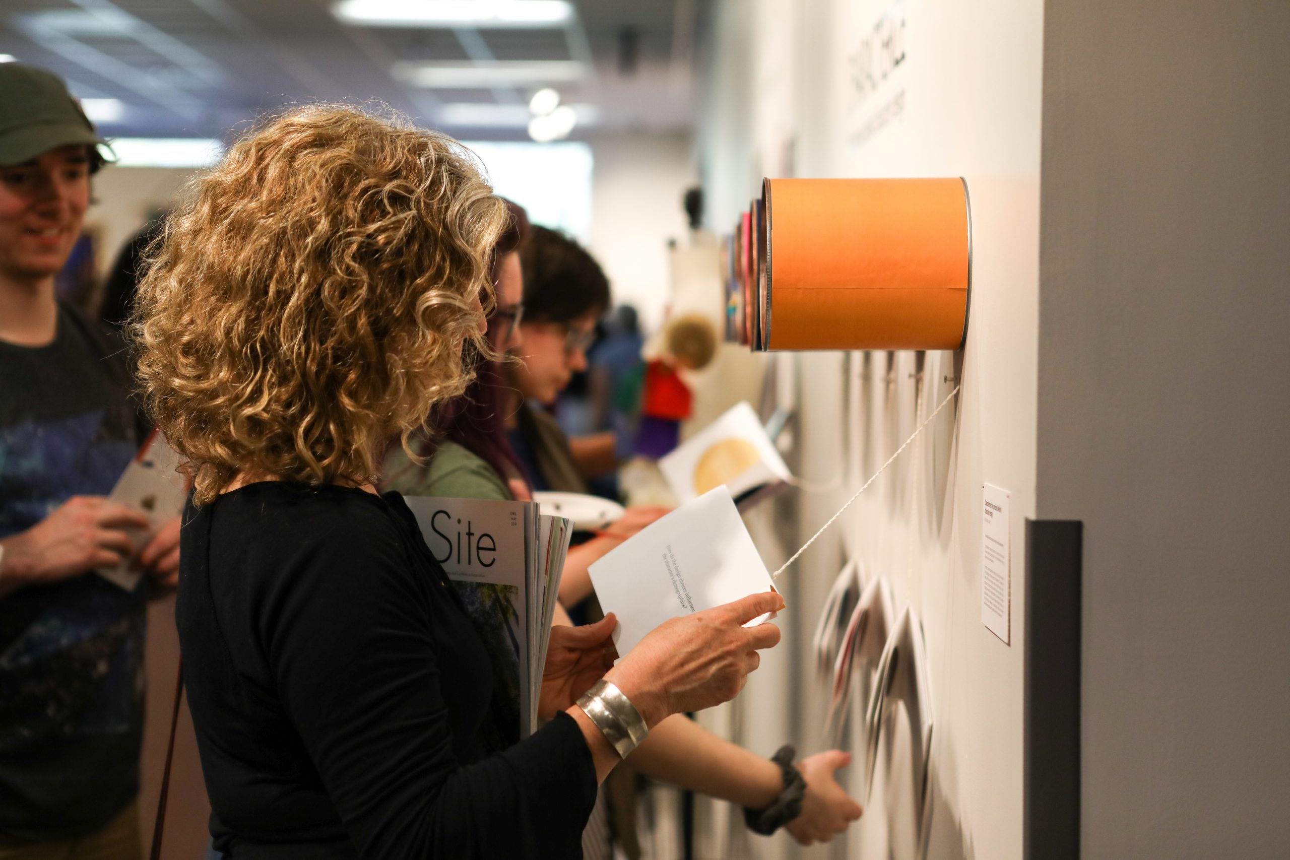
For the installation, I designed a wall-mounted display that would both elevate the handmade figures and invite viewer interaction. The layout encouraged user-participatory design and slow engagement, as visitors could move from one character to the next, physically flipping through pages while viewing the corresponding 3D figure in context.
The final presentation encouraged tactile exploration, visual storytelling, and emotional connection. It turned passive observation into active curiosity and invited viewers to not just see the characters, but understand how and why they came to life
DESIGN SKILLS
Design Thinking – Developed a concept-driven installation that explored the storytelling through physical and visual design.
User Experience (UX) Design – Created an interactive gallery experience where viewers could physically engage with books and 3D characters in a sequential, intuitive layout.
3D & Material Design – Crafted original character figures from unconventional materials (rubber bands, cans) to emphasize texture, form, and emotion.
Book & Print Design – Designed, printed, and assembled custom books for each character.
Color Theory Application – Built character personalities and narratives around emotion and symbolism.
Exhibition Design – Strategically planned and installed the gallery display, balancing visual impact with accessibility, viewer flow, and narrative clarity.
Brand System Development – Unified the entire project with consistent type, layout, and color logic across books, labels, and physical components.
Public Presentation – Presented and discussed the work in a professional gallery setting, demonstrating communication, critique response, and audience engagement skills.
